
Design system accessibility guidelines
Work for : Medidata
HealthTech, IT
2019
Individual Project
PROJECT OUTCOME
Accessibility UX/UI guidelines are designed to be integrated with the existing Medidata Design System to help Designers, Developers and Testers create products that are accessible for people with permanent disabilities but also improve the experience of other users. (a clickable prototype below)
Learn more how I got there
CONTEXT
The main focus of my summer internship in Medidata, was an indvidual project which was supposed to be related to accessibility. It was an independent work, from creating a project brief, making a project schedule to execution and prototyping. I will explain the project in details further on this page. During the internship, I was also involved in a group project, in collaboration with engineering, testing and marketing interns, focusing on the future of healthcare and decreasing environmental impact through Virtual Clinical Trial.
My Role: research, survey design and analysis, interviews, product audit, Design System and UI Kit audit, Design System guidelines design, clickable prototype design
RESEARCH
Discovery of accessibility
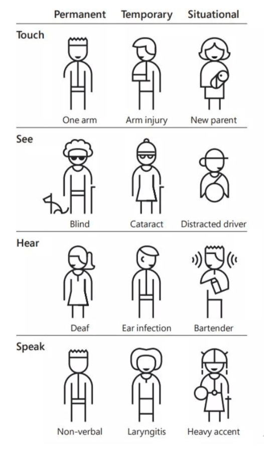
Accessibility is the quality that makes an experience open to all. Disability can affect different senses – touch, visual or hearing – or affect speaking; furthermore, it can be temporal or situational. The latter, situational, can affect anyone.

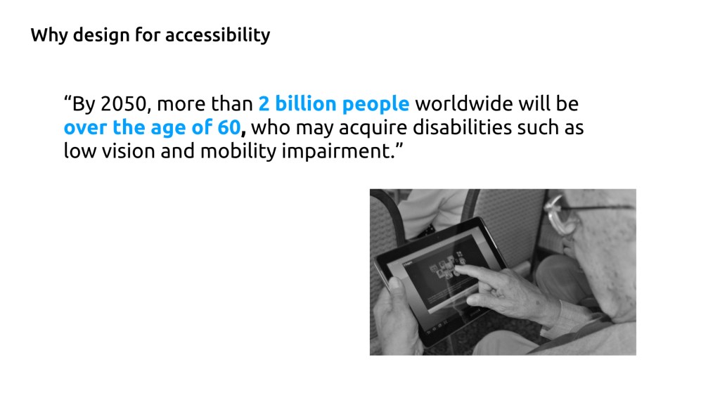
Digital accessibility
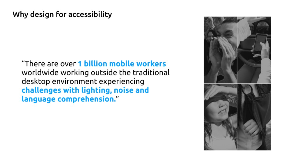
It means building a digital content and applications to used by people with disabilities. It can apply to websites, mobile apps, despot apps, electronic documents and more. Many of us experience situational disabilities, such us: buttons on the screen are too small and difficult to click, low colour contrast on the interface difficult to read or choose a button (especially if the screen reflects the light) and many more.

Medidata’s products users, Clinical Trials Researchers or Doctors, often work while traveling from one site to another and experience a lot of situational disabilities. This is why, when designing a digital content, we should consider making it accessible for everyone, accommodating for non-ideal environments.
Define a project focus
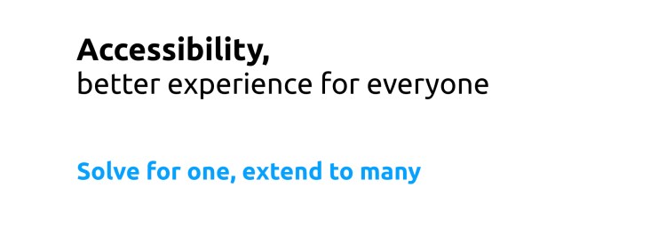
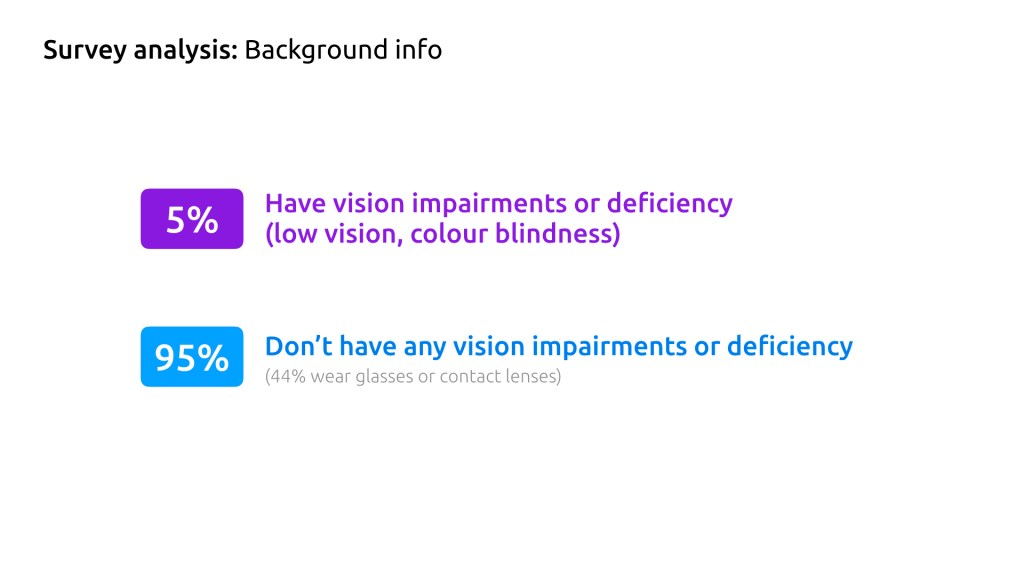
In my project, I decided to focus on vision disabilities, because they can be solved with the user interface design. What I knew is that people with permanent visual impairments, such as low vision, or deficiencies, such as colour blindness, struggle to use digital products and platforms that are inaccessible. My assumption was that making a digital products and platforms accessible will improve not only permanent visually impaired users’ but everyones’ experience.
Survey Design
To better understand users’ digital experience, I prepared a survey titled “Your experience in Digital world” for Medidata UK office employees. Given, the constrained time of my internship, we could not reach out to clients and it was the quickest and easiest way to get a feedback about various digital products and platforms.
The aims of the survey were: to validate the assumption that you do not have to be permanently disabled to find accessibility features helpful in some situations and that even in Medidata we have users with special needs or habits; to find out the most common struggles/habits/preferences/needs and which accessibility features people find the most useful/necessary.
Survey Analysis
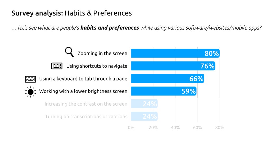
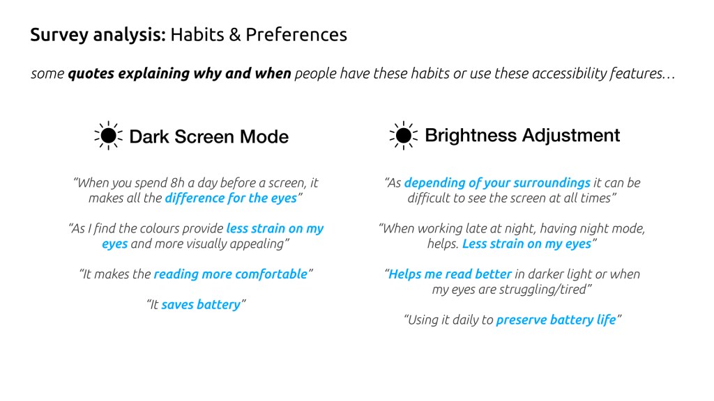
In the diagram there are 4 habits and preferences that are the most common (more than 50% people have it).
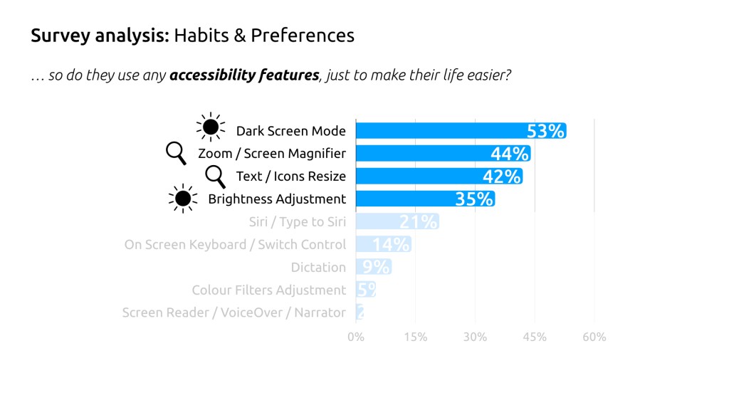
People who are not disable still use some accessibility features, just to make their life easier. It is interesting that more than 50%(!) of people use Dark Screen Mode, so maybe it is worth to consider it while designing interfaces?
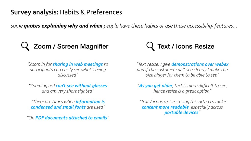
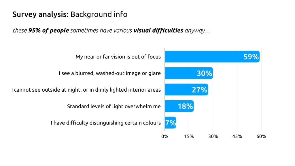
I found out which visual, cognitive, functional struggles people have and selected these, that are low hanging fruit to implement and good to start with:

After that, I realised that new guidelines need to be designed in order to apply these accessibilitiy improvements.
DESIGN PROCESS
Developing guidelines
After the discovery phase, I decided to create Accessibility guidelines for Medidata UX/UI Design, that might be integrated with Medidata Design System later on. I reviewed many trusted sources with accessibility guidelines in order to get some knowledge and inspirations, such as: UK Gov WCAG, IBM Accessibility check list, Google Material Design, Apple Guidelines, Microsoft Inclusive Design, BBC Accessibility and many more.
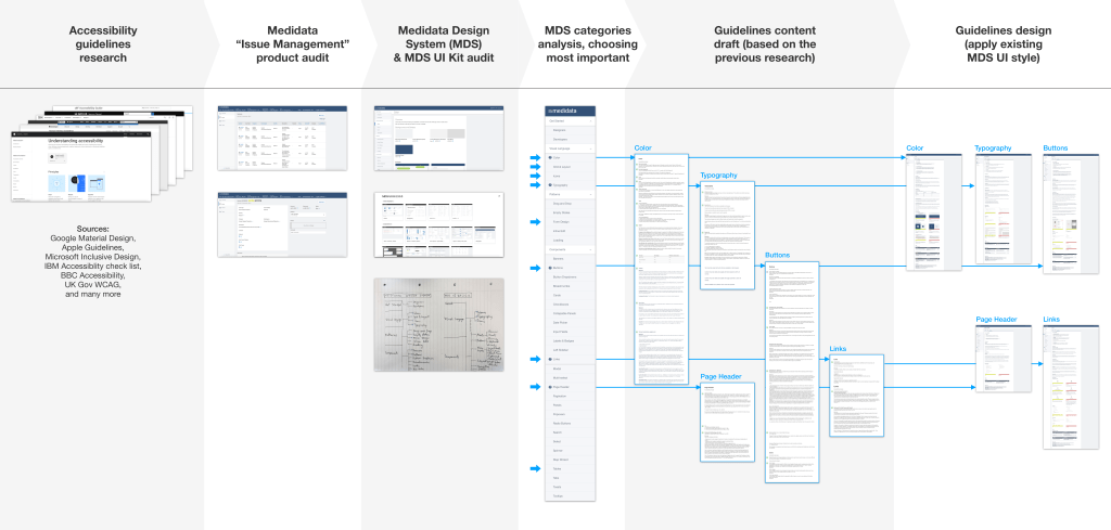
Then, I made an audit of the Medidata product I had an access to, in order to have a context for my design. After that, I analysed exciting Medidata Design System &UI Kit to see where and how I can add a value. Later, I chose the most important categories where accessibility guidelines should be added and prioritised them. When they were ready, I started making a content draft for each category (the accessibility guidelines content was based on the initial research I have done). Finally, I could apply the existing Medidata Design System UI style to keep consistent and easy to integrate. To make it clear how it works when integrated, I did a clickable prototype in inVision (attached on the top of the page).
Guidelines structure
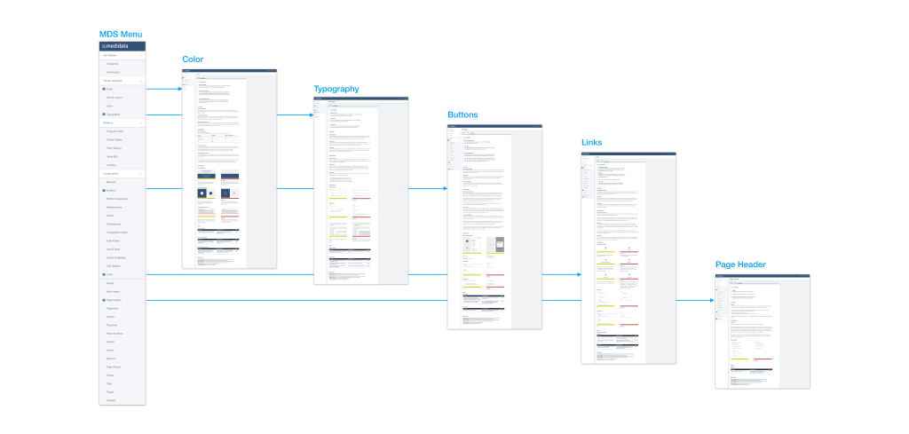
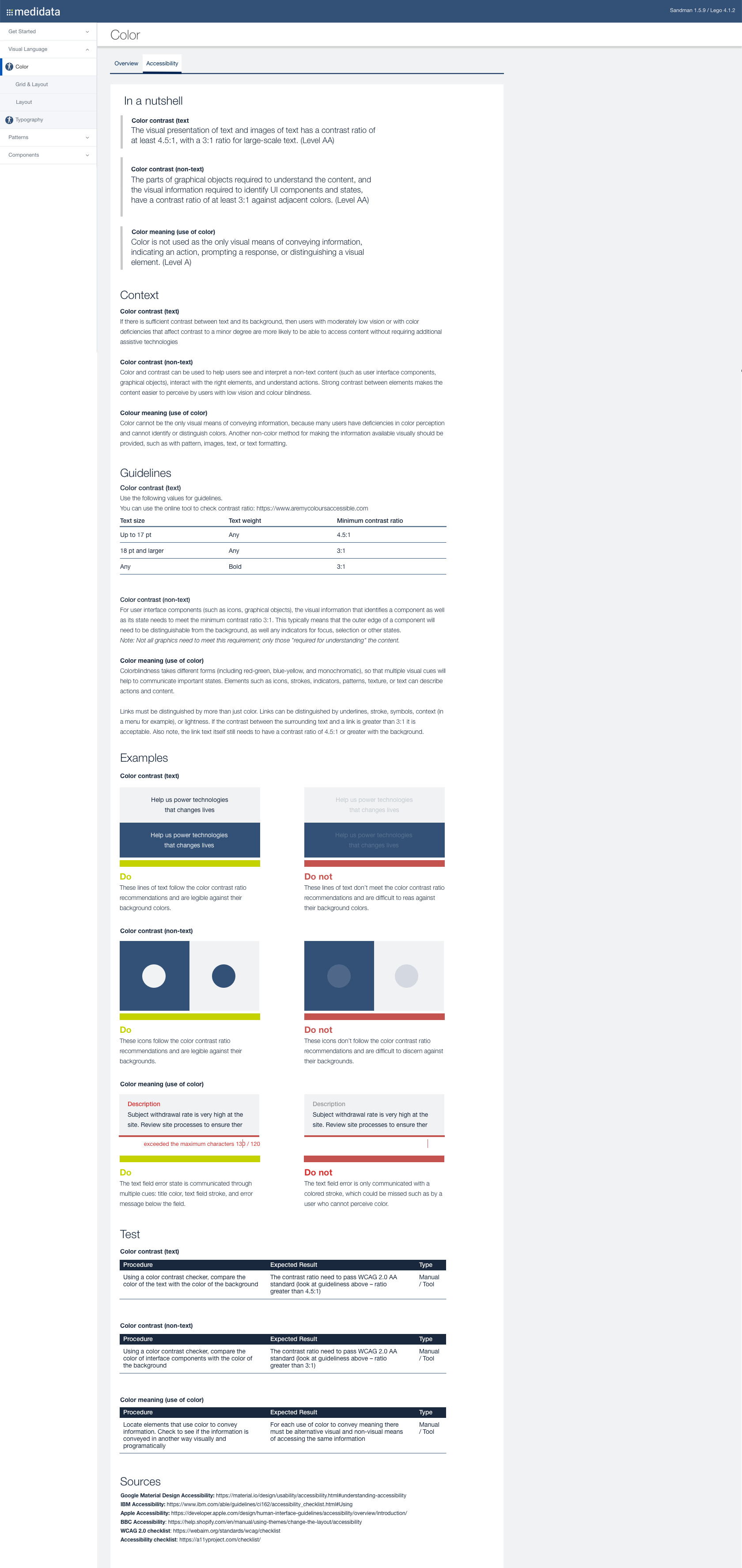
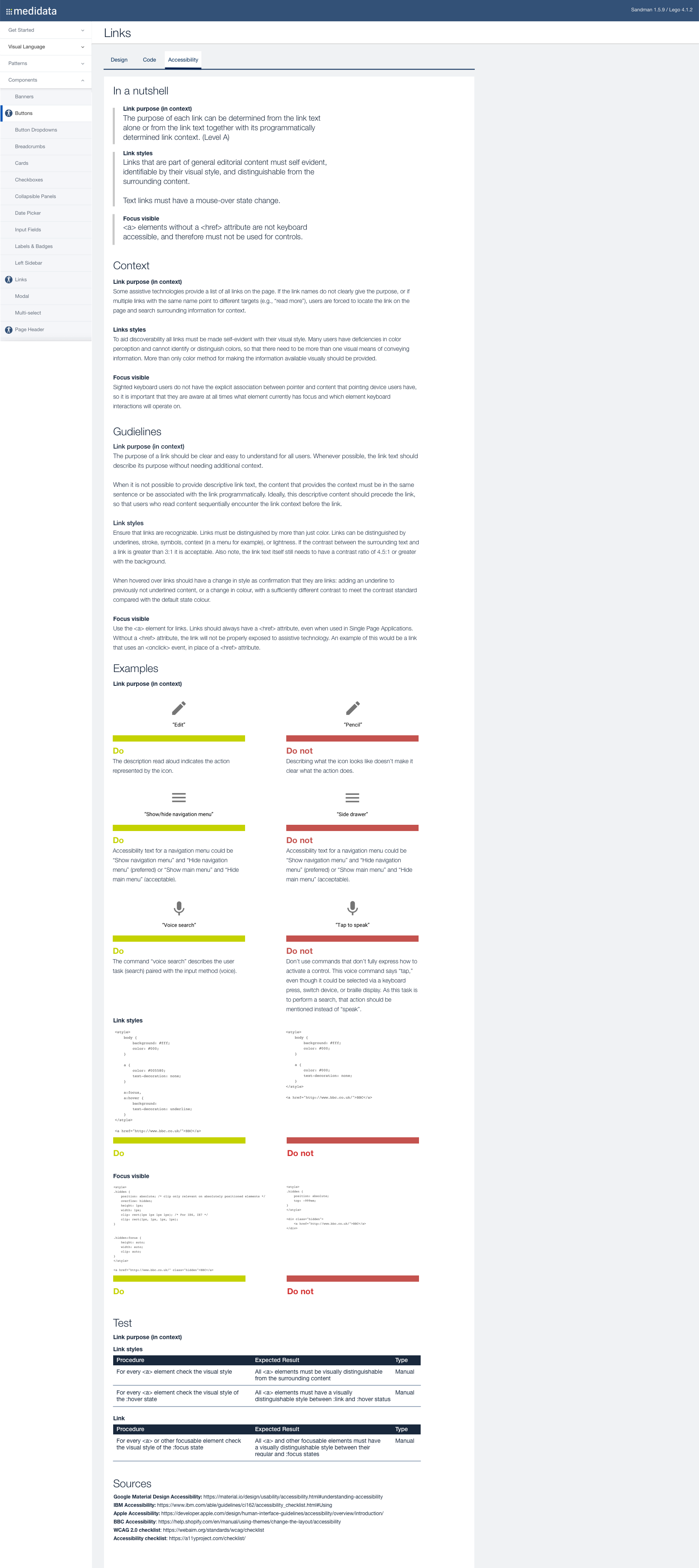
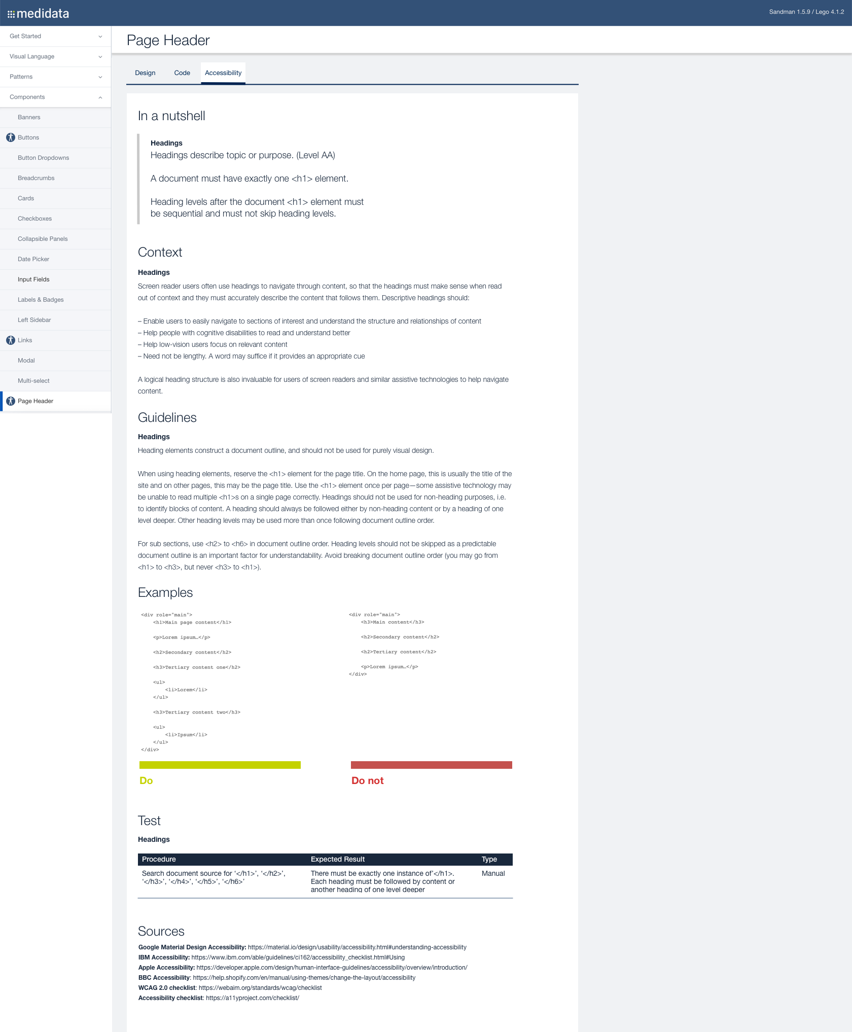
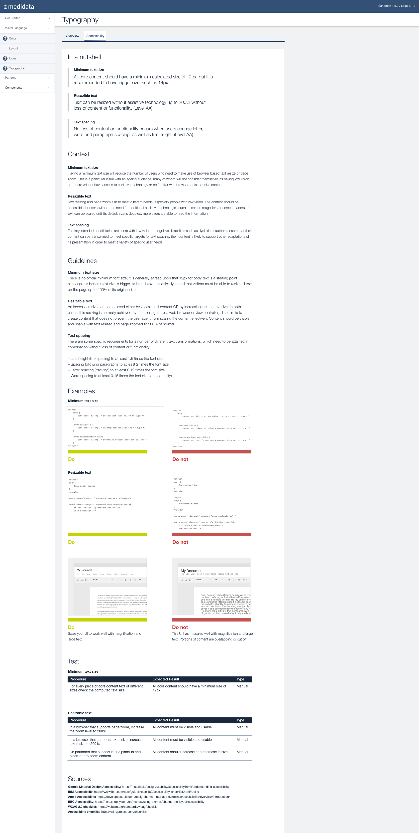
Categories from the Medidata Design System that I chose to start with are: Colour, Typography, Buttons, Links, Page Header. These are the ones that people struggle with in some situations if they are not designed properly (as validated in the survey). Also these improvements will be easy to implement and will be a “quick win”, good to start with.
Each page starts with some key information in “In a nutshell” section at the top. Then, there is a “Context” section with the reasons for its importance and an example situations. Below, there are “Guidelines” and “Examples” sections, if possible, both for Designers and Developers/Testers. At the end, there is “Test” section with the Procedure and Expected Result.

 Agata Juszkiewicz